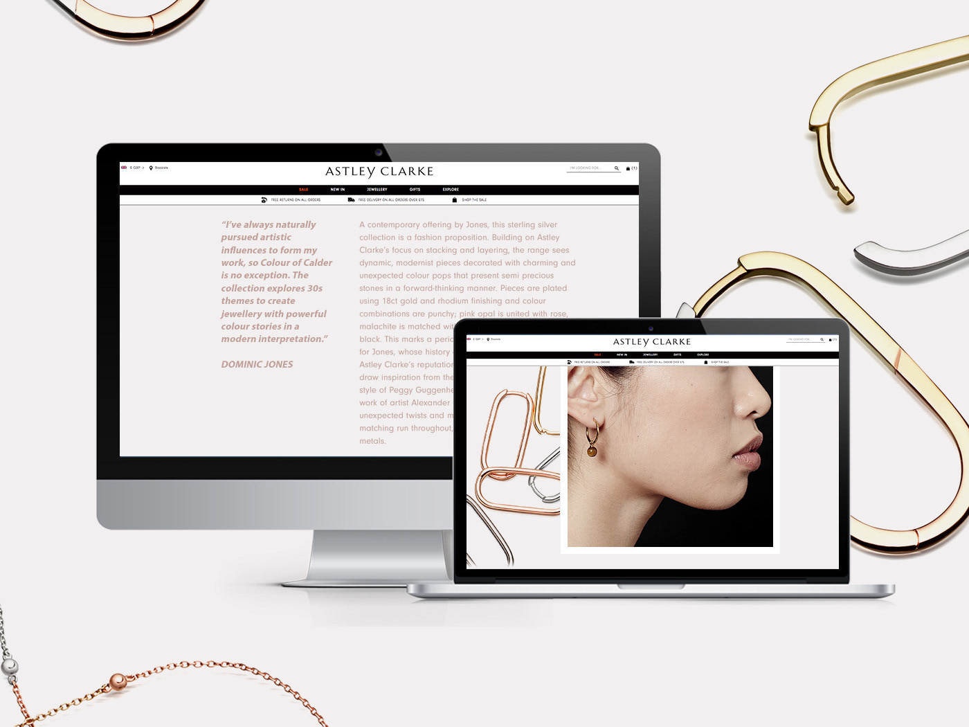
A chronological depiction of the transformation of the Astley Clarke homepage showcasing the changes, additions and thought processes behind the designs.
Astley Clarke was founded in London by Bec Astley Clarke MBE in 2007, to celebrate design, innovation and colour in fine jewellery. A desire to speak to a new generation of consumers, and propose relevant, quality fine jewellery for the modern woman underpins the brand's identity and offer.
+ Original Website Wireframe
+ First Adaption
Keeping the main hero header I decided to ddd three visually different sections/modules to the landing page in order for the marketing and web team to talk more in depth about collection launches and social events. The original design was very image heavy so a carousel was added to highlight the new products added to the site and subsequently can also be used to introduce sale highlights or editors picks.
+ Second Adaption
For the Christmas campaign a video module was added to the homepage using the still live campaign shot as a textured background. The carousel was removed in order to accommodate more content blocks to discuss core pieces as well as a space to promote the online gift guide.
+ Third Adaption
For the launch of the zodiac pendants I designed a module to showcase all 12 star sign pendants which automatically switches over on the first day of the of the next zodiac sign. The pendants are are also engravable on the reverse so a CTA was added to either take the customer to the personalisation page or straight to the product description page.
+ Fourth Adaption
For the final and current modification of the homepage the central module was expanded in order for it to be a full width content block. To mimimize the amount of time spent on the homepage we shortened the amount of time spent scrolling by removing two blocks and instead introduced a live feed instagram carousel. Two new typefaces were also introduced to the site, Baskerville Old Face and Better Signature.
