Having worked on the Interest-Free Vouchers for over a year I identified several areas in how we could further develop the look and feel to introduce a more premium aesthetic to a heavy promotional messaging.
Stage 1
The first hurdle I wanted to tackle was to create consistency with the typographic treatment of the voucher messaging across all of the web AEM, Monetate banners, marketing and social assets.
Stage 2
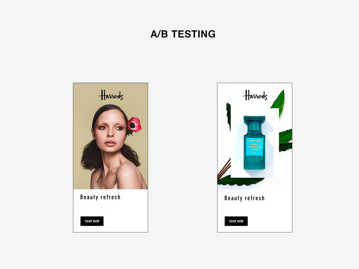
For the next stage I wanted to look at how we display the codes for the many assets we need to create, I‘ve designed two variants, a landscape and the square, again there’s quite a lot of information we need to include which can be tricky for some assets such as the Monetate banners. To get around this we’ve either used abbreviations such as EXCL for exclusions or we’ve removed the copy from the graphic and placed within the header text component
Stage 3
Finally to tie the vouchers in with the premium look and feel of the site and photography I found a series of paper ribbon images in Getty in different curl patterns and bold colours with deep and strong shadows. I thought this would work really well as it would give us the opportunity quickly differentiate between the many codes we need promote with the paper ribbon alluding to a pleasant surprise/gifting or treats.
